
Dropdown Field Styling – Formidable Forms
Dropdown fields are a staple of any form that requires the user to make a selection. Often a much better choice than radio buttons, as they take up a lot less space in your form, dropdowns (or <select> elements) are used millions of times a day.
But like radio buttons and checkboxes, default dropdown fields are generally styled by the browser and can be difficult to re-style to fit your sites branding & design style. But that doesn’t mean you can’t re-style them, it just requires a bit of work.
These fancy dropdown fields have all been created using the standard Formidable Forms dropdown field element and then re-styled based on a post by Mary Lou on Codrops. So if you fancy trying some dropdown field styling lets jump in…
About Dropdown Field Styling
To create these styles we need to take a similar approach to how we re-styled the Checkboxes and Radio buttons in our previous guide. Essentially what we’ll do is hide the default <select> element, copy each of the options from it and create a selection of new <div> elements using some JavaScript which then gives us full control over the styling and animations.
Note i: It’s worth pointing out at this stage that by hiding the <select> element and replacing it with a custom <div> we are losing the accessibility options that come with using a standard dropdown so if user accessibility is it a priority then these styles are probably not for you.
Note ii: It’s also worth highlighting at this stage that these styles work well with basic dropdown fields but do NOT currently work with any of the following field options and will require additional development if you want to use any of these features:
- Read only
- Multiselect
- Autocomplete
How to use these style
To get started with these styles you will need to download a zip file from our GitHub repository, unzip it and then upload the folder (called dropdown-styles-FF-main) to your web-server. We tend to put all of our custom styling & scripts in the wp-content folder and then in a sub-folder but where you put them is up to you.
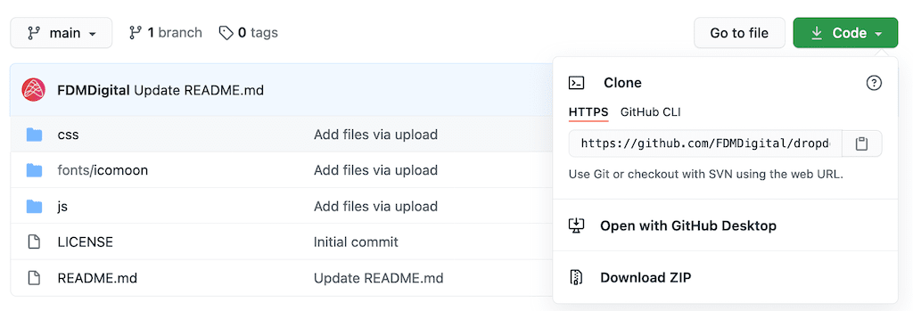
If you’re not familiar with Github, click on the link below and then click the green Code button > Download Zip as per the screenshot below.
Once you have the files uploaded to your server you can continue with the steps below.
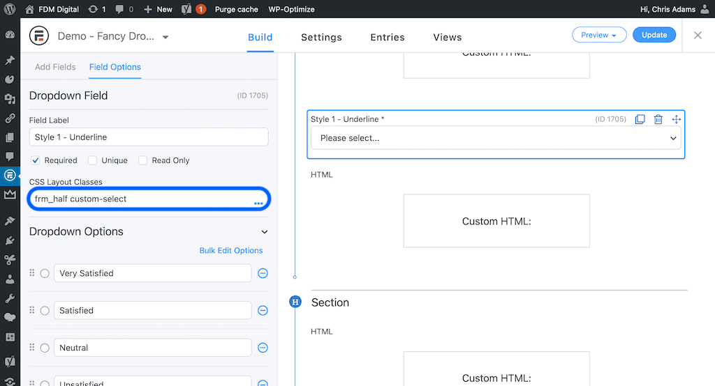
Step 1:
- Add a dropdown field to your form
- Add the class “custom-select” to the Field Options > CSS Layout Classes
- Save the form
Info: We use the class custom-select to automatically set the z-index levels of the dropdowns and form sections on your page to make sure that the dropdown menus always appear on top of all other content when clicked.
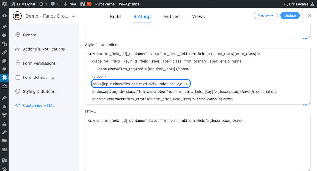
Step 2:
- Go to form Settings > Customise HTML
- Find your dropdown field and look for the
[input]shortcode - Replace the shortcode with this:
<div>[input class="cs-select cs-skin-underline"]</div>
Note: The class cs-select must kept in place in place regardless of the style you choose but the class cs-skin-underline can be changed to whichever style you want to use. We also need to wrap the [input] shortcode in a <div> to make sure that the field description div is still added in the correct place in the dom if you decide to use it.
The 4 style classes are:
- cs-skin-underline
- cs-skin-border
- cs-skin-elastic
- cs-skin-rotate
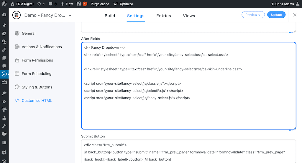
Step 3:
- Scroll down to the After Fields section of the form and add the style sheets and scripts below.
- Save the form
<!-- Basic styles - this must be included -->
<link rel="stylesheet" type="text/css" href="/your-directory/dropdown-styles-FF-main/css/cs-select.css">

<!-- Underline style - optional -->
<link rel="stylesheet" type="text/css" href="/your-directory/dropdown-styles-FF-main/css/cs-skin-underline.css">

<!-- Border style - optional -->
<link rel="stylesheet" type="text/css" href="/your-directory/dropdown-styles-FF-main/css/cs-skin-border.css">

<!-- Elastic style - optional -->
<link rel="stylesheet" type="text/css" href="/your-directory/dropdown-styles-FF-main/css/cs-skin-elastic.css">

<!-- Rotate style - optional -->
<link rel="stylesheet" type="text/css" href="/your-directory/dropdown-styles-FF-main/css/cs-skin-rotate.css">

<!-- Fancy Select Scripts - these must be included -->
<script src="/your-directory/dropdown-styles-FF-main/js/classie.js"></script>
<script src="/your-directory/dropdown-styles-FF-main/js/selectFx.js"></script>
<script src="/your-directory/dropdown-styles-FF-main/js/fancy-select.js"></script>
Note: You do NOT need to add all 4 optional styles unless you plan on using all 4 in the same form. Simply pick the one that matches the class you added to your dropdown field.
For example if you added cs-skin-underline to the [input class=”cs-select cs-skin-underline”] shortcode then you only need to add the matching style sheet to your After Fields section.
<!-- Basic styles - this must be included -->
<link rel="stylesheet" type="text/css" href="/your-directory/dropdown-styles-FF-main/css/cs-select.css">

<!-- Underline style - optional -->
<link rel="stylesheet" type="text/css" href="/your-directory/dropdown-styles-FF-main/css/cs-skin-underline.css">

<!-- Fancy Select Scripts - these must be included -->
<script src="/your-directory/dropdown-styles-FF-main/js/classie.js"></script>
<script src="/your-directory/dropdown-styles-FF-main/js/selectFx.js"></script>
<script src="/your-directory/dropdown-styles-FF-main/js/fancy-select.js"></script>
Useful Information
Changing Styles
You may want (or need) to make changes to these styles to fit with your website theme or branding. Where possible we have included CSS variables in these stylesheets which pull from the Formidable Forms stylesheets and inherit styles already set in your Formidable > Styles settings to minimise how many changes are required.
For example the Underline Style above uses the CSS variable var(--border-color-active) for the bottom border colour of the field and for the hover colour of each element in the dropdown. On this site that colour is a dark purple but on yours it will be whatever you set it to in the Formidable > Styles settings.
In some cases we have also had to add a back-up CSS rule as some older browsers (Internet Explorer) can’t render CSS variables.
These styles or colours may not work for you so you can change them in a couple of ways:
- You can overwrite any individual styles by adding your own in the Formidable > Styles > Customise CSS editor. You may need to add !important to the CSS rule to overwrite the existing rules.
- You can edit the stylesheets directly and re-upload them to your server.
Choosing the right style
Which style you choose may depend on the content of your dropdown field. For example the Underline & Rotate styles both use CSS keyframe animations to animate each item in the dropdown. For this to work correctly we have included (in the fancy-scripts.js file) a script for counting the number of items in each of the dropdowns on your page and adding an incrementing CSS animation delay so that they animate in nicely regardless of how many items are in the dropdown.
This works really well for short / medium lists but won’t work very well for really long lists like Countries or States as it will take a really long time for them to finish animating in.
So choose wisely!
Vanilla JS & jQuery
Although 2 of the files (classie.js and selectFx.js) are written in vanilla JS the file fancy-select.js contains a mixture of vanilla JS and jQuery so you WILL need jQuery installed for this to function correctly. There are more and more WordPress themes now that don’t include jQuery by default so bear this in mind.
Update:
We’ve been informed that these dropdown styles didn’t work if you had conditional logic or field calculations tied to the dropdown field. We tested this and found it was because ‘real’ the dropdown field (which is hidden) didn’t trigger a change event in Formidable as it was being updated with JS. We’ve now amended this and these styles should now work with conditional logic and field calculations.
You can test this out by selecting Very Satisfied from the Style 1 – Underline dropdown in the demo above (spoiler alert: a Date field will appear).
Thanks to Studio Pence (via Slack) and Kim Takal (via email) for pointing this out to us.
